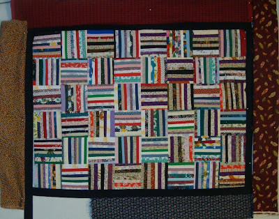
Someday I am going to remember to take photos for my blog during daylight hours. These photos are of the same quilt. I can't figure out how to make blogger rotate the lower one but there ya go!
I decided to go with a 1" black inner border and found these four potential fabrics for the wider outer border. All the fabrics are the same in both photos, but they look very different. I am leaning toward either of the fabrics on the left or right in the upper photo (top or bottom in the lower photo). What do you think?
Hop over the Judy's blog and see the loveliness others have posted.


I like the one that reads as a solid red in the top photo. That brings out the bits of red in the body of the quilt, I think.
ReplyDeleteI love that quilt... I just do!
ReplyDeleteI'm with you on the two borders you're thinking about... and will vote with pcflamingo for the red!
I vote for the one on the right. though the red looks good, the one on the right is more unexpected!
ReplyDeleteI thought I would like a red border, but have to say that the blue print really sets off the quilt squares. The red seems to be competing a bit.
ReplyDelete